A Vibrant World with Ian Mackay of Hi-Bred
Ian Mackay is building a world, and a very vivid one, at that. It’s filled with hyper-colored buildings, vaguely familiar streets and neighborhoods, and the rules of the world are slightly bent to Ian’s liking. Rare Device customers know Ian’s work under the name Hi-Bred, a company he started to publish his line of zines, comics and collaborations with friends. The Hi-Bred prints we’ve carried have been photo-realistic, fluorescently-colored apartment buildings in San Francisco. In his gallery show, Clay Sunset, opening in the Rare Device gallery on Friday, June 16th, Ian showcases another side of his artistic style, and explores another beloved neighborhood in the city. We got a chance to ask Ian about risograph printing, storytelling through illustration, and what’s coming up for him in 2023.
RD: What is your background as an artist? How did you become an illustrator and founder of Hi-Bred?
IM: I went to design school for landscape architecture and worked in that field for a couple years, but I realized I was mostly interested in the graphic side of things. I heard people were using risograph machines to publish their own comics, so I did some research and found out that Tiny Splendor in Berkeley was offering workshops where you could learn to use one. The whole process really clicked for me, and I’ve been a member of their studio ever since. Hi-Bred is the name of the self-publishing practice that grew out of that. I mostly publish my own comics and prints, but I also collaborate with artist friends and other small presses.
RD: Can you explain to our audience what risograph printing is?
IM: It’s like a combination of a xerox machine and screen printing. It’s as fast as a xerox machine but only prints one color ink at a time like screen printing. You can layer those colors by passing your paper through the machine multiple times. Most of my prints use yellow, fluorescent pink, and blue ink.
RD: How would you describe your illustration style, and why is risograph printing a good fit for it?
IM: I would say I work in a few styles, but they have certain things in common. I like to create a scene with depth and strong composition is very important to me. I like using vibrant colors and depicting architecture and landscape. I think risograph is a good fit for me because it can produce very colorful results and I like the methodical process of designing and printing.
 Editorial Illustration by Ian Mackay for The New Yorker
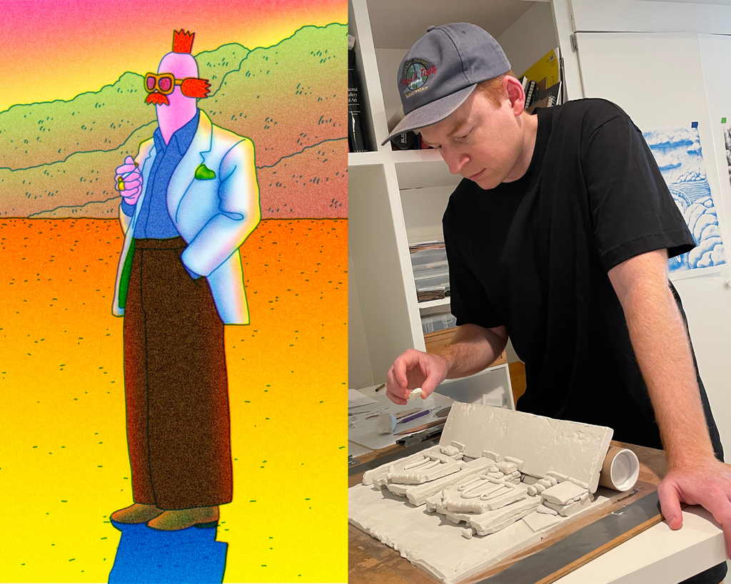
RD: Your use of clay and risograph is so unique, and gives your pieces so much texture. Where did you learn to combine the two and can you walk us through the process for creating the pieces for the show?
IM: I’ve always liked working with clay and after working with the risograph for a while I realized it would probably render the clay texture really nicely. The first thing I made this way was a comic zine collaboration with my friend Matt Goldberg called West Coast Soft Boys. We developed a story together, Matt sculpted and photographed the clay pieces we needed in his studio, and then I used Photoshop to stitch everything together, adding color and other details. 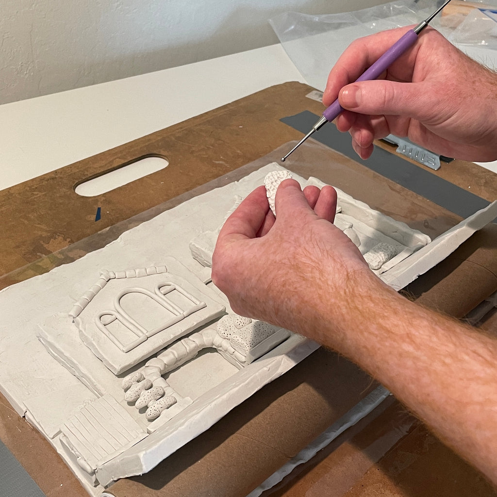
I used a similar process to create each piece for this show. I looked through photos I’ve taken on walks to pick a scene I liked. Then I made a simplified sketch and used it as a guide as I sculpted the scene in clay. I photographed the sculpture and then used Photoshop to add color and other details to the image. Finally, I printed it on the risograph machine, using yellow, fluorescent pink, and blue ink.
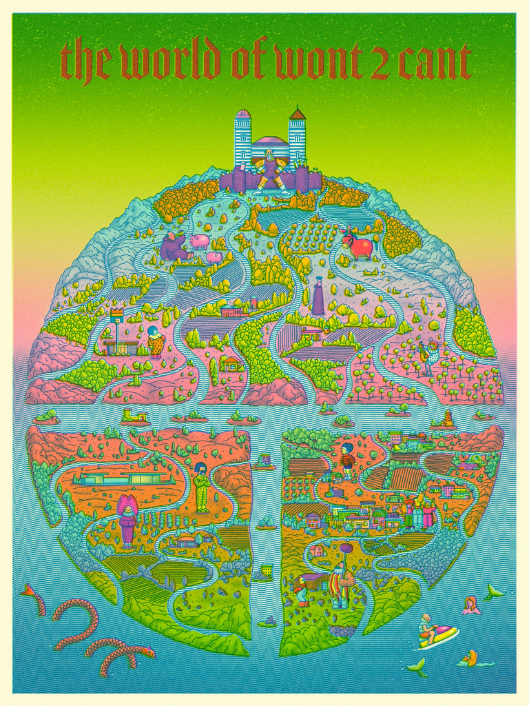
RD: You’ve mentioned world-building and storytelling in your artist statement. Can you share with us what world-building you’ve created in your zines and comics?
IM: In most of my comics I want to create a setting that is specific, but also unique to the story I’m trying to tell. I like to design the buildings and interior spaces and the objects to look a certain way. But I also think about aspects of the world that are a little more subtle, like the culture, the types of technology that they have or don’t have, etc. I like it when there is a certain consistency to all these things, and I think that comes across to the reader.
RD: You mentioned that you just finished a book - congrats! Can you share a bit about that project?
IM: Thanks! It’s Part II of a graphic novel trilogy I am working on with my friend Gavin Owens, called Wont 2 Cant. The story is set in a world that combines elements from medieval Europe and contemporary times. They have a lot of modern technology, but not everything, and a lot of stuff we don’t. There is a peasant rebellion, a Knight who rides a mechanical flying horse, a Duke and Duchess who own a chain of convenience stores… It’s been fun to work on and also quite challenging.
RD: You’ve said that walking around the Sunset makes you feel like you’re in a toy landscape. What was your favorite toy growing up?
IM: I loved Legos the most.
RD: What’s coming up for you? You mentioned you’re moving! Where to? How long have you lived in SF?
IM: I’ve got a short comic zine for kids that will be done in July, and I’ll be exhibiting work at the San Francisco Art Book Fair and LA Art Book Fair. And yes, planning to move back to the east coast towards the end of the year. I’ll definitely miss the beauty of California.
Clay Sunset will be in the Rare Device gallery June 16th - August 6th.
Interview by Jenn Zipp
1 comment
I love you. And I love your artwork(as you know)